HookSounds
original in-house royalty-free music
HookSounds is a bootstrapped music platform competing with much larger, well-funded companies like Epidemic Sounds and Artlist. I am part of the small agile team where everyone goes beyond their role description with the object of pushing the company forward.
At HookSounds, my work transcends pretty screens. It's hard numbers, conversion, product strategy. It's obsessing over user behaviour as it translates into revenue – why aren't they purchasing, why aren't they converting, where do they visit more, how can we move them from there to where we want – and while we strive for these business objectives, I continue to advocate for the users.
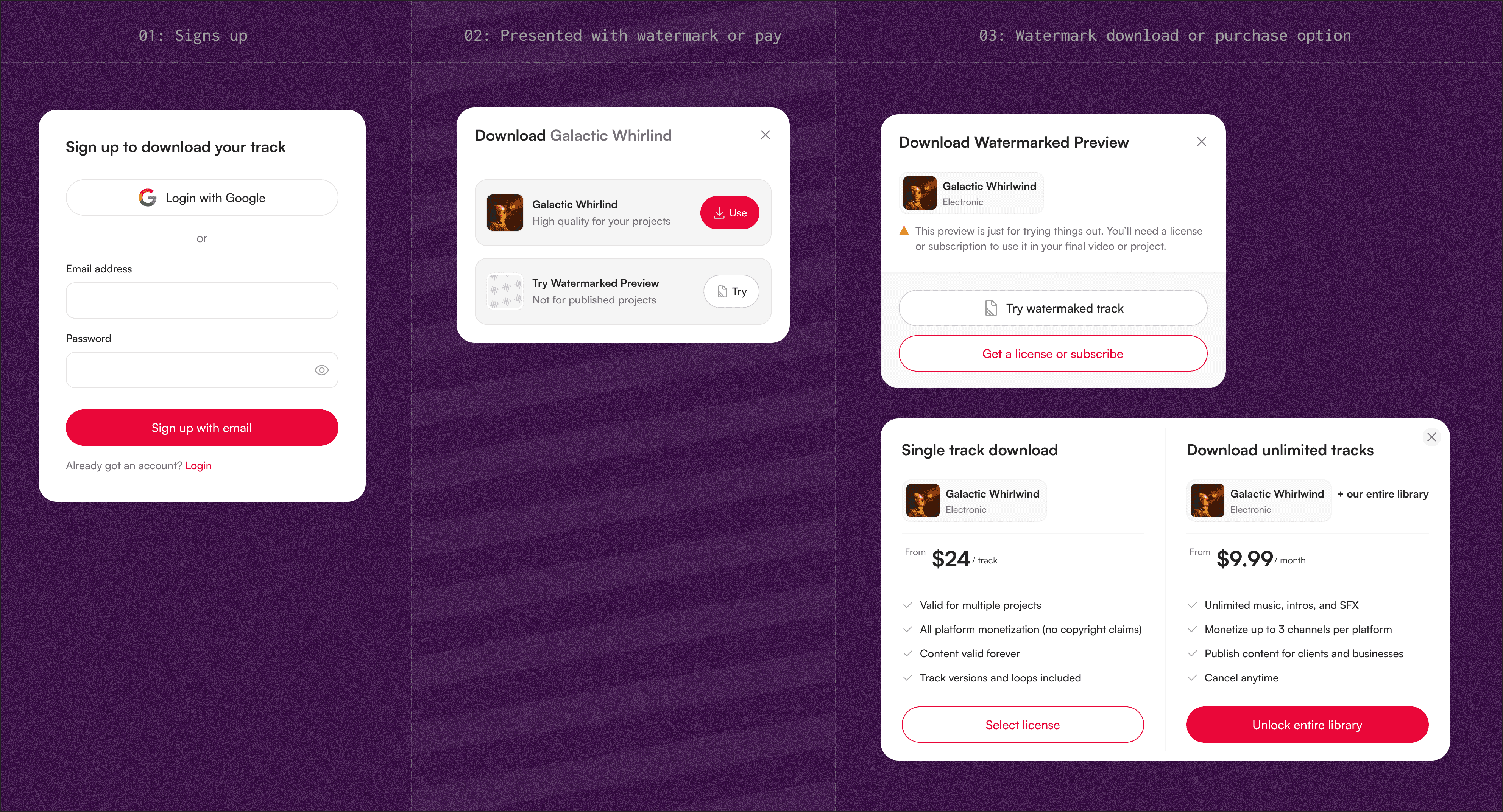
REPLACING FREE TRIALS WITH WATERMARKS
Data is the cornerstone of our every action at HookSounds. We noticed we were getting a lot of user who were trialing but not converting. These users usually tend to download >50 tracks during free trials period. Users who convert on the other hand download tracks at a lower level over their free trial period, and continue this level of download when they convert.
The "cancellers" tend to ask for refunds when they forget to cancel before free trial ends, which negatively affects our standing with the payment processors. We also noticed there was a lack of clarity as to what the users thought they could do with the tracks downloaded during free trial – they cannot be monetized, but many tries to do that, get claimed, and develop a negative opinion of our product and services.
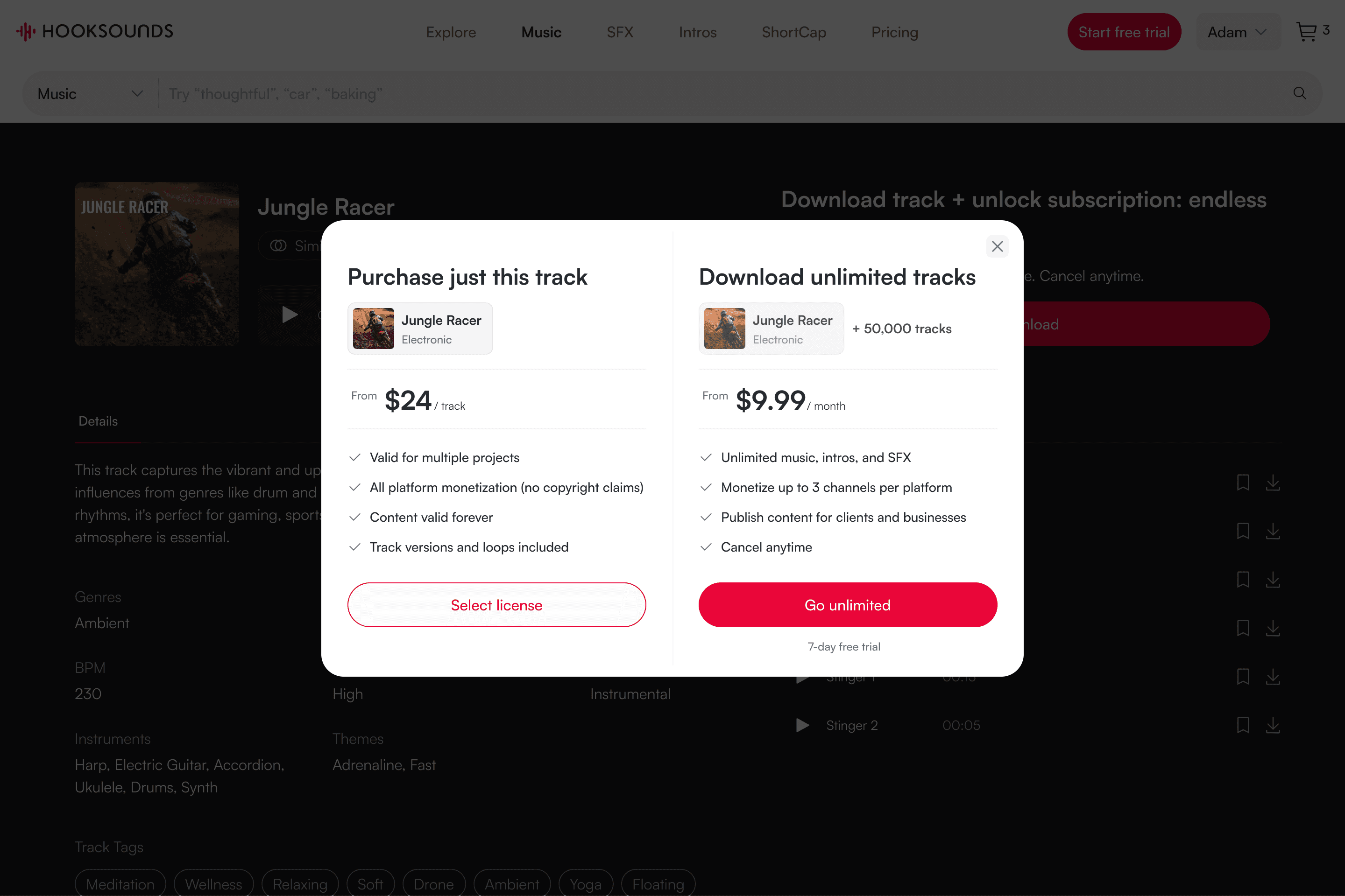
To combat all of the above, we decided to provide a two-pronged solution. First, we provided limited number of tracks as free music for users who don't intend to pay. Next, we removed free trials which filters for more serious customers. We understood that free trials has the benefit of allowing users test tracks in their product before purchasing. To still give them this opportunity, we opted to provide watermarked copy of the track. The watermarks also prevent them from attempting to monetize that tracks, preventing frustration by preempting it.
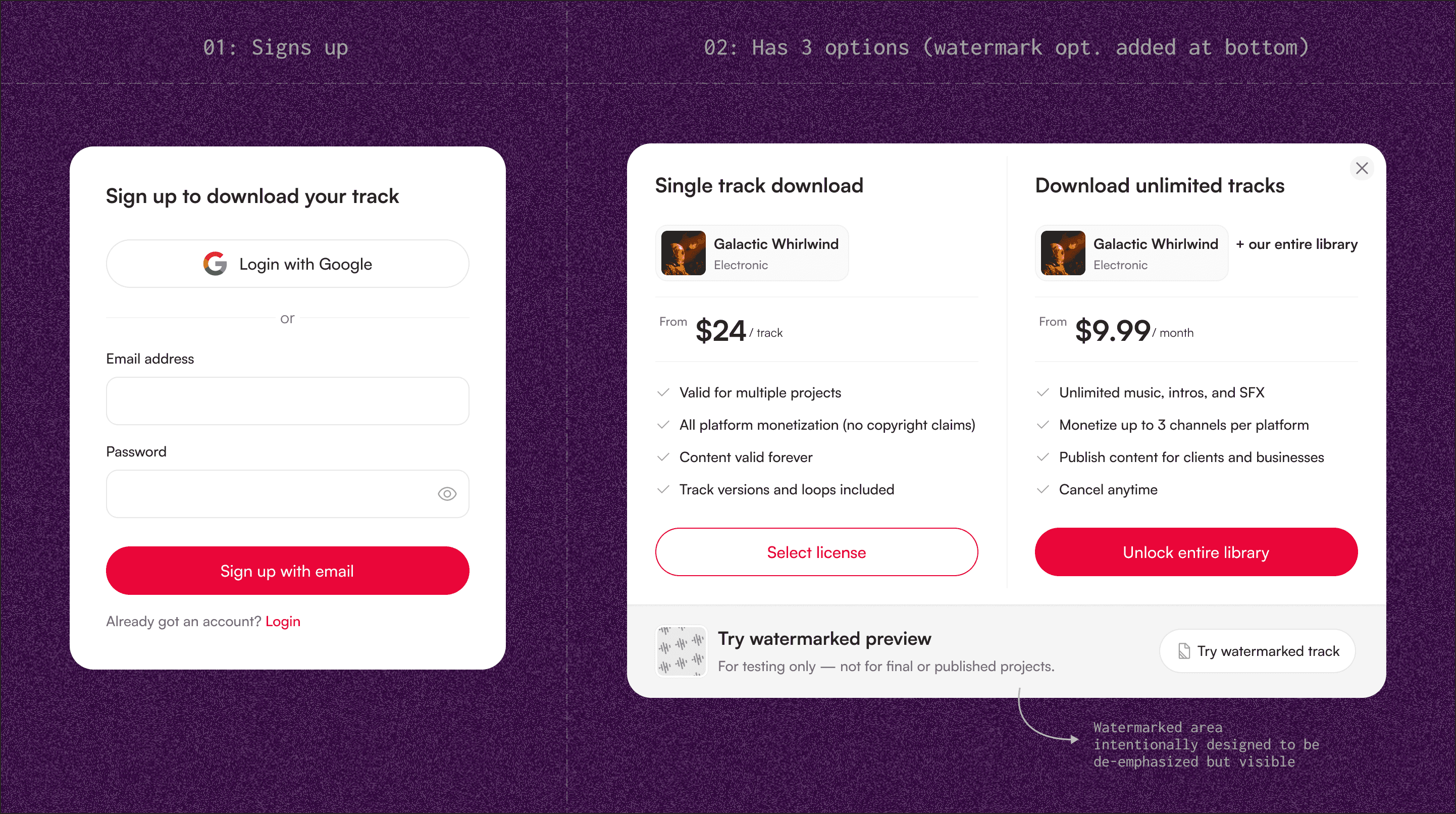
Adding the watermark option
One of my main consideration while designing this page was to ensure there are no additional clicks for users who still wanted to make a purchase directly. Also, we had seen great success with this modal, so I didn't want to upset that, hence the above. See the alternative I didn't move forward with below as it hides key actions behind an extra click.
I didn't move forward with this exploration as it adds an extra step for the user
PLAYLISTS – as a purchase intent
My argument to convince the team to take on the playlist redesign, amidst other important projects, is that it's a purchase intent. For platforms like Spotify and Apple Music, playlist helps the user to organise their music. For HookSounds, which isn't primarily a streaming service, playlists serve a different purpose.
Playlists are primarily used to save tracks which the users believes they may use in a project in the future – hence future purchase intent. Our historical data also showed that users who creates a playlist ends up making a purchase – either a single license or subscription.
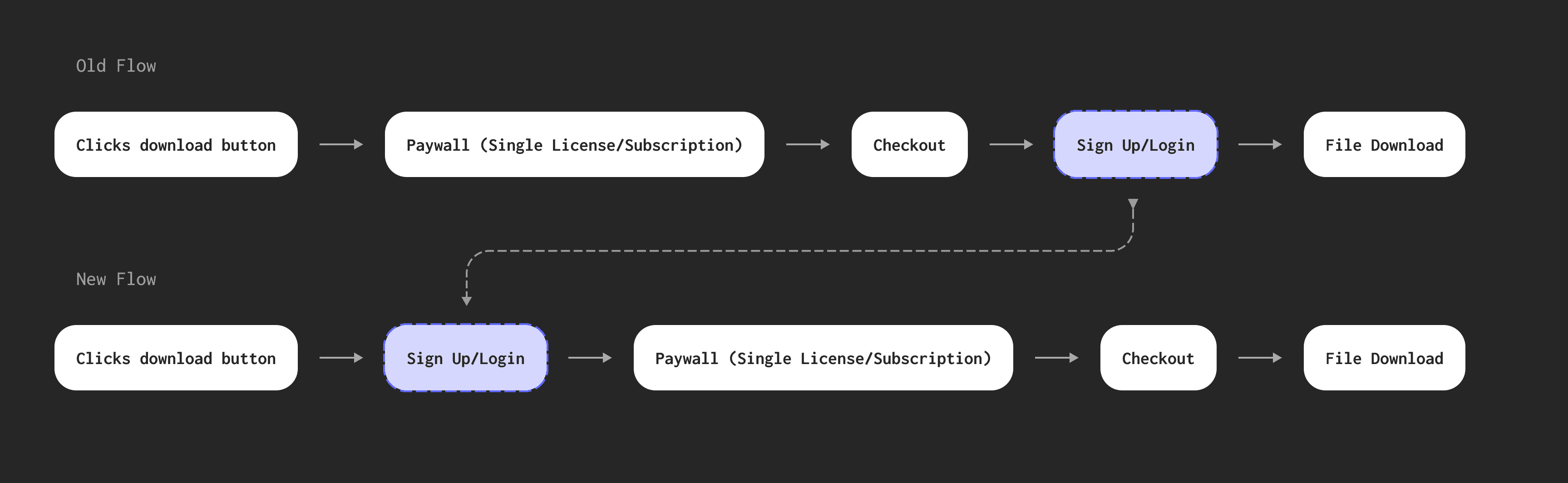
Issues with the old flow
Understanding the issues and flaws of the old flow helps appreciate the work done in the new flow. These issues include
use of the favorite "love" icon to add an item to the playlist
whenever you have an item in any playlist, the love icon turns red
no way of knowing if you already added a track to a playlist
hence, you can add the same track to a playlist multiple times
no friction to stop adding multiple track to a playlist
inability to remove a track from a playlist without digging into the playlist details in settings
playlist is hidden under the profile dropdown
Old Flow – Showing some of the issues that needed fixing
The solution: simple but powerful changes
To make the playlist feature more powerful, I added a "plus" icon which allows user add a track to any playlist. The favorite icon then has a more niche function – a quick way to add an item to their Liked Tracks (a default playlist created by us).
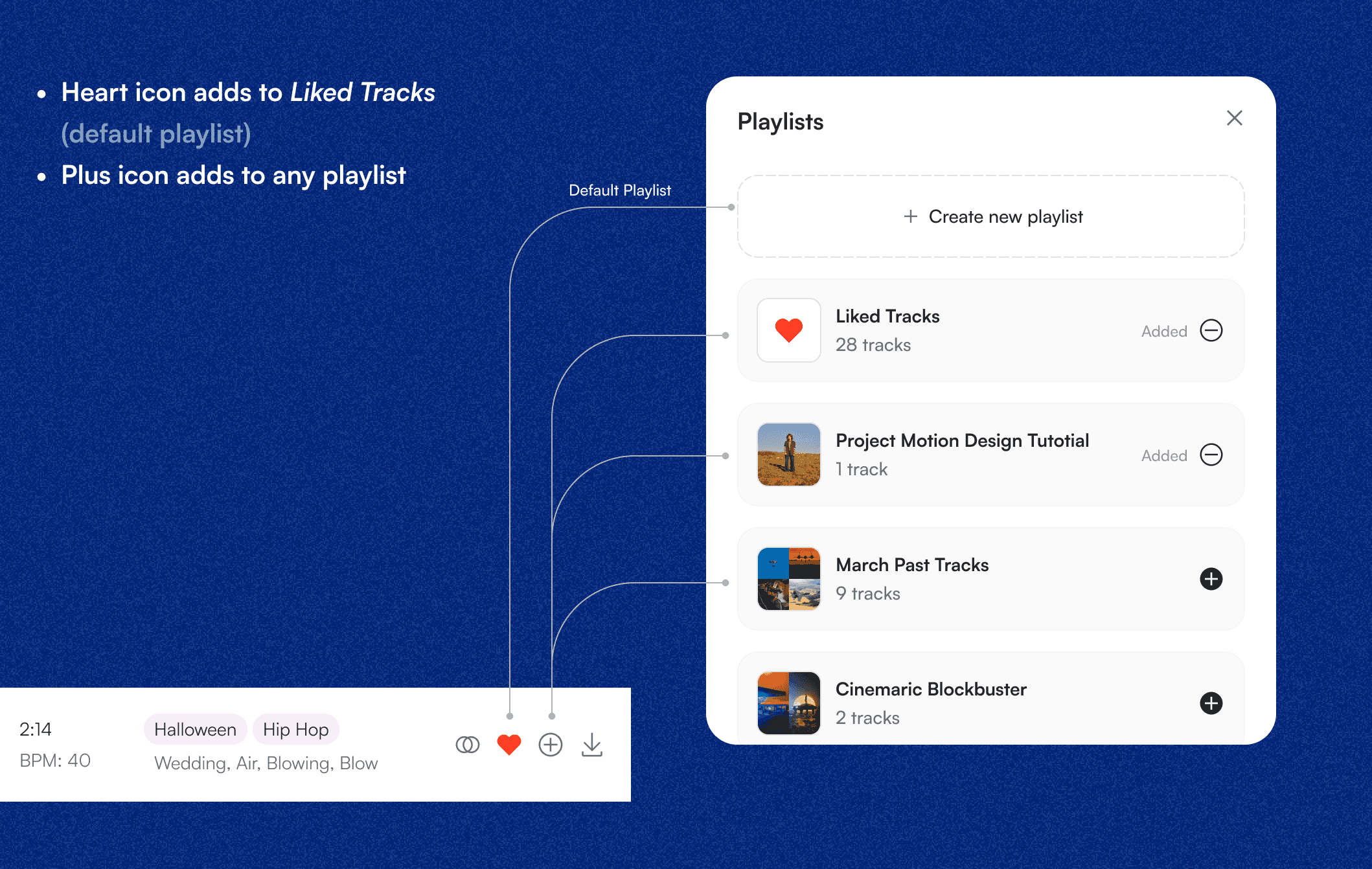
Giving users new ways to save music for future use
In addition, I re-imagined the whole flow, giving the users new ways to easily create new playlist, view their playlist, and even add related tracks (suggested) by us to the playlist. I also designed a proper playlist page to allow users, and added it to the navbar.
These changes are a win-win for both the users and the business.
Updated flow – improved add-to-playlist, designed playlist page
GROWING OUR EMAILING LIST – increasing marketing opportunities
Not all design tasks involves moving pixels. For the project, the objective was to take advantage of our overwhelming traffic to increase our mailing list and potential customer base. This had to be done without harming our current revenue.
I noticed an opportunity in our flow which may very well improve the number of people we can market to. It's simply took reorganising the flow.
When potential changes are high-stake, we have a culture of designing an A/B experiment where we pitch the new change vs the old one, and judge them with predetermined metrics.
Proposed change to increase mailing list – and potential sales.
Results of the experiment
The result showed that this strategy works. There was less than 5% change in the revenue while the sign-ups (ergo mailing list) grew by 440%
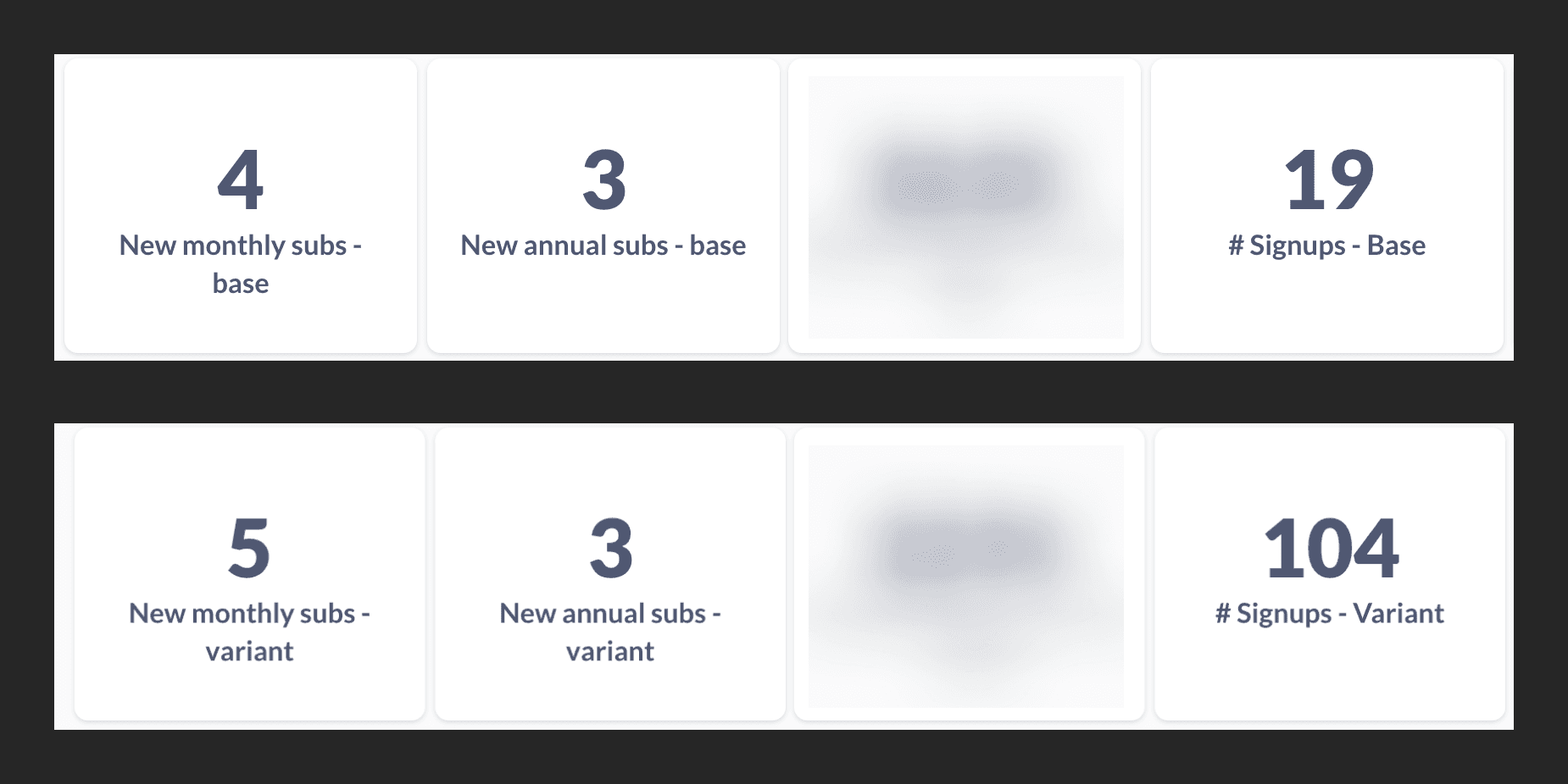
Some of the results of the experiments
BOOSTING SINGLE LICENSE SALES
Single-license purchases had been declining because the option was buried in a dropdown and hard to use. This is despite the traffic & traffic demographic suggesting that there should be more purchase activities.
One of the hypothesis put forward was that some users don't want to be locked into the subscription model, especially if they do not have an ongoing need for tracks. We confirmed this by setting up a simple questioning where we polled our users.
The result was a 200%+ increase in single-license sales after launch.
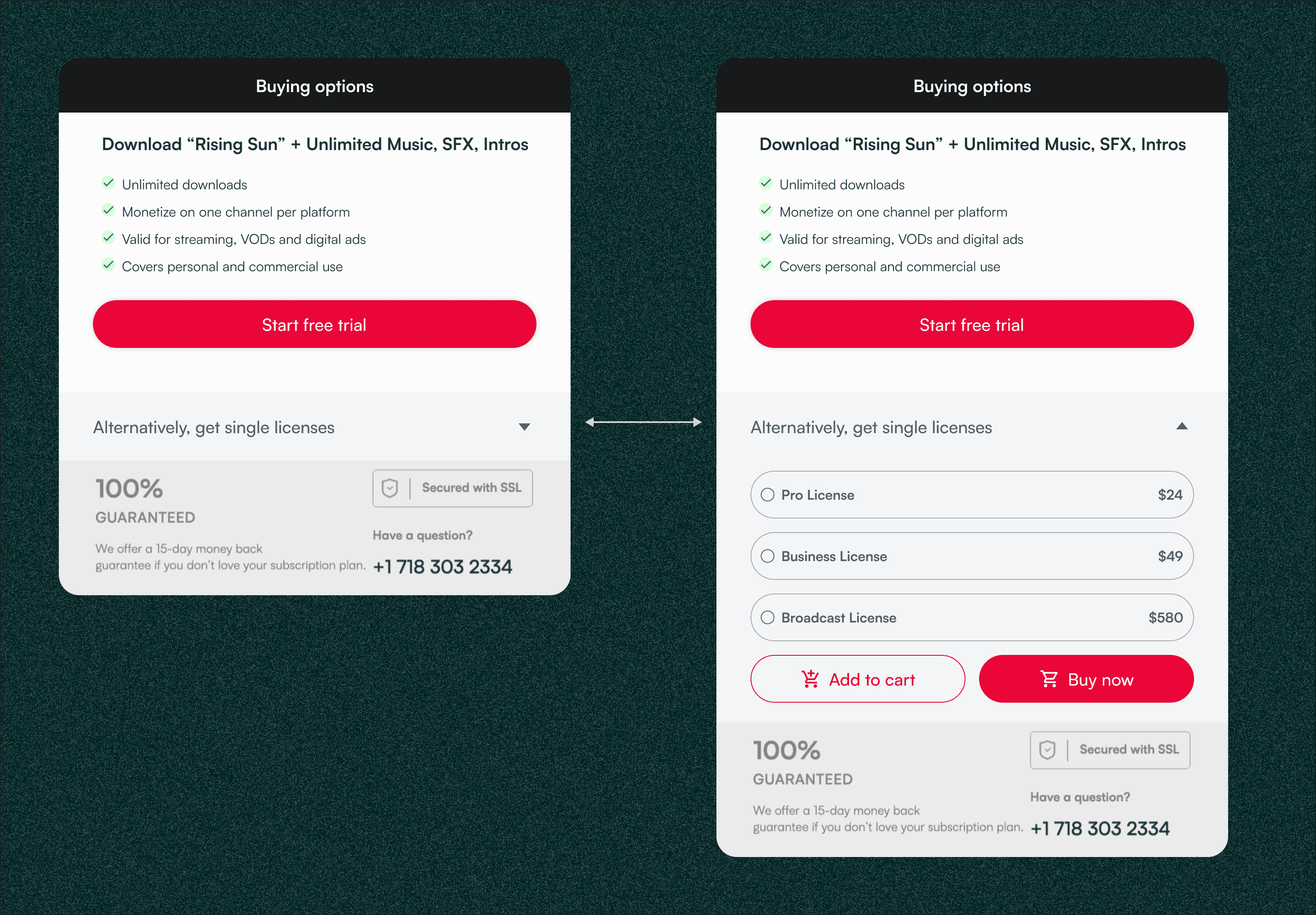
Redesign of payment options – exposing the single license option better
Below, you can see what the old options looked like. This new design introduces clarity, helped users compare the options better across several considerations including price, use etc.
Some of the results of the experiments
Results
This project proved to be one of the most rewarding. We had a 200%+ increase in single license purchases, and in about 6 month, single licenses have grown to 30% of the company's revenue. The continue to grows as more users are able to have this as a consideration when making purchase.
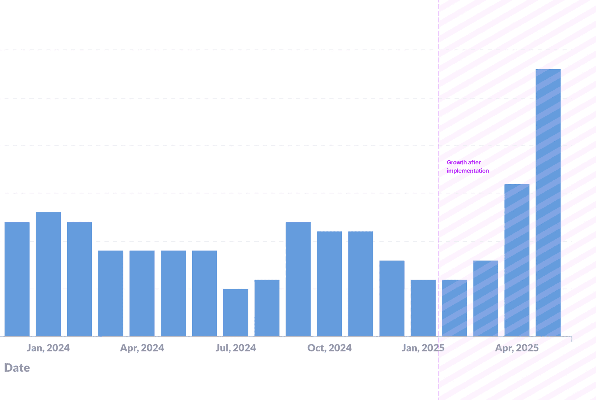
Single license purchase following implementation of improved payment modal
Going beyond
While working on this design, I noticed some other opportunities for clarity and improved experience in the single license flow – namely the cart.
The cart experience is suboptimal, and makes users commit error where they add multiple items to their cart unknowingly. As part of the strategy to further clarify single licenses, I redesigned the entire cart experience.
Some of the results of the experiments